Sunday, August 31, 2008

Kwento ni Enday Layout

Here is Kwento ni Enday customize layout, Winner of Customize Layout (week-9).
Layout info:
Title of the blog, tag line (if you want)
- Kwento ni Enday (Pakikipagsapalaran ng isang Enday)

Graphic or picture for the header
- http://i214.photobucket.com/albums/cc3/dhezza24/images.jpg
(gusto ko po sana yung tipong Pugad Baboy sa comics yung dating, yung pang humor blog po talaga yung style saka madaling magload. and yung tama lang po yung laki nung header.)

Color combination
- black, red, and white (white po yung pinaka background, pinaka highlight po yung black and red)

Layout style
-3 columns po,asa middle yung post entry.
I never heard Pugad Baboy ... Thanks to mr. Google wink*... I'm not an artist and this is the best I came up for her requested layout design. Please visit her blog to see it live.

Labels:

Saturday, August 30, 2008

Thoughts of a SAHM Layout

Here is Rosemarie customize layout Winner of Customize Layout (week-8-1). And finally got a chance to send the layout code to her. Thanks so much for you patient miss, very much appreciated.
Layout info:
tittle : Thoughts of a SAHM: Diary of a single mom, rants, reviews and anything that life has to offer
layout style: 3 column
post entry: in the middle
color combination : blue {#99C9FF} kaw nalang po bahala magcombine ng colors hehehe..
pictures: see attach
Here's the look. Please visit her blog to see it live.


Labels:

Friday, August 29, 2008

Bright Ideas Layout

miss Jana create the original header and install the entire layout already on her blog but she wasn't happy the results and had a hard time matching up the color. Carlota to the rescue! wink* "Pakatawa lang miss" ... I just kind of re-create it for her and she was pleased the results. Thanks so much miss, very much appreciated.

Please visit her blog to see it live!

Labels:

Thursday, August 28, 2008

In my Dreams Layout

Layout info: Mitch provided me couple of graphics to use for the header and aqua or turquoise for color combination. And here's what I come up with. Please visit her blog to see it live.
Thanks so much Mitch that you like the outcome of your layout.

Labels:

Monday, August 25, 2008

The Green Man in his Green World

Another blog layout of Marky. If you have notice kinda same as his Tiklaton layout but a little lighter. He provided me all the graphics for the header and got the color combination from it. I'm happy the outcome of the layout. What do you think?

Please visit his new blog to see it live. The Green Man in his Green World.


Labels:

Sunday, August 24, 2008

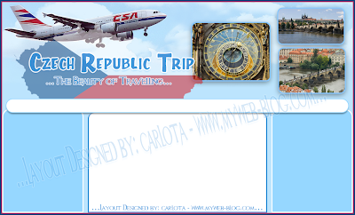
Czech Republic Trip Layout

Here is Tess customize layout Winner of Customize Layout (week-8).

Layout information:
* Title of the blog, tag line :Czech Republic Trip (The Beauty of Travelling)
* Graphic or picture for the header (Palihog og tan-aw sa akong attachment dire Cho)
* Color combination... (White and blue)
* Layout style ... 3 columns
* Post entry... MIDDLE
Please visit Czech Republic Trip to see it live!
Tess enjoy your layout. wink*

Labels:

Live Life to the Fullest Layout

Another one- finally installed for ms. Gen. Thanks for the patient Gen, I really appreciate it.

Layout information:
She provided me all the photos for the header and got the color combination for the entire layout from the photos. Then right side for all the sidebar widgets, white color background just like her other blog Life has a lot to Offer
Please visit Live Life to the Fullest to see it live.

Another blog of hers I previously designed.

Labels:

Saturday, August 23, 2008

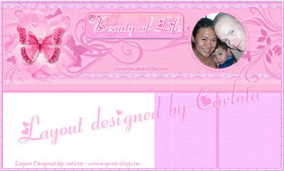
Beauty of Life Layout

Finally installed Jona's blog. Sorry sis didn't get a chance to install right away.

Layout information:
Color - lavender/pink (light color)
Design - can be digiscrap or just anything. Naa butterflies and flowers.
Blog post alignment is left lng man. Then 4 columns.
header - naa ko nkita na hinimo nimo nga naa pictures sa header. gusto nako ibutang picture namo whole family sko blog makita ang pic.
Please visit Beauty of Life to see it live.
Thanks again Jon! So, glad you like it. And thank you for understanding.

Labels:

Friday, August 22, 2008

Hobby and Such by Carlota

Thursday when I was home not feeling good after my long nap I put together another blog for my all time hobby which is sewing, crafts and gardening. Actually the idea when I was thinking of changing my layout for my creations blog I asked help and with the comments Hobby and Such by Carlota got created.

Here's the look... please visit to see it live.
The header concept: dresses I have sewn for my DD when she was a toddler, landscape of our garden; I design the landscaping of our front garden and I did all the hard work. Funny story, we had a radio remote control of our satellite TV. I put Julie in front of the TV locked her walker so she can't pushed around I let her watched her favorite channel Disney and PBS while I was outside working on my garden; since I have the radio remote control with me I changed channel when it’s time for the show; changing the channel she feels like I’m inside the house. I am just so lucky that she loved to watch TV. hahaha

Anyway, in my Hobby and Such blog I will be sharing all my previous creations. Who knows I'll have the time to create a new ones. wink*

Getting hungry, all for now ... Have a wonderful weekend everyone. Hugs & kisses.

Labels: ,

Saturday, August 16, 2008

My Creations Layout

Another blog? Yes, I create another one for my scrapping. It's new to me; well not really, just the way I put together is not like how the digiscrap looked. I remember back when I enter a contest making LO’s and I didn’t understand the whole concept of the LO’s. Honestly I was embarrassed by it. But this time I give it a try to enhance my skills into digital scrapping. I hope I can keep up.

Here's the look of my Creations Blog ... the layout I put together from the FREE kit shared by ShabbyPrincess ... You can download the free kit just click HERE.

Please visit my new blog and to see it live! ... My Creations

Labels:

Thursday, August 14, 2008

Damuhan Layout

Here is Arvin's customize layout Winner of Customize Layout (week-7).

Layout information:
Damuhan here. The following are my details for the layout:

Title of the blog, tag line: Damuhan: Blog ng Pinoy. Tambayan ng Pinoy
Graphic or picture for the header: see attached file
Color combination: black and green and white (or similar to my current layout)
Layout style: 3 columns
Post entry : left
By the way, favor po. Pwede ban’g style high tech yung blog pero still may grass pa rin? Pleaseeeee...
Arvin, glad you like it. Sorry the high-tech look hindi kaya ng power ko. And thank you at nagustohan mo though not as high-tech look. I am still a novice with this making or designing layout. And I'm not an artist or designer; I just tried my best to design the layout as per request. It helps me a lot though when I visualize the request first.

Anyway, please visit his blog to see it live!

(print screen was from my practice-blog wink*)

Labels:

Sunday, August 10, 2008

Wonderful Life Layout

Jana's blog...She gave access on her photobucket and saw the pics of her. See the header? That's it! hehehe. Thanks Jan that you are happy with your new layout.

Please visit her blog to see it live!

Labels:

Tuesday, August 5, 2008

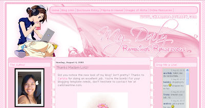
My Daily Ramblings Rendezvous

I had a layout auction off at BisdakPlanet for a good cause and for the BisdakPlanet Foundation. Princess the author of My Daily Ramblings Rendezvous was one of the bidders but she didn't win the auction. The winner of the auction did not choose the color I have auctioned off instead she requested one for her best friend favorite color. So, I YM Princess if she still interested the layout she said yes and offer to gave for the BisdakPlanet Foundation. Thank you so much Princess!


This was the layout I have auctioned off at BisdakPlanet.


Here's the look...Please visit her blog to see it live!


Monday, August 4, 2008

Tiklaton

Here is Marky's customize layout Winner of Customize Layout (week-6).


Congrats to Marky!


Layout info:

 Marky's simple request ... 1. Three columns lang japon. Post entry sa center. Then sidebars sa kilid (of course..sidebar gani..LOL), with the same width. Ang widths of 3 columns kay katong pareha kadako sa ako domain lay-out (please). 2. Title is "Tiklaton" then ang tag line is "_we are the witness!" 3. Colors are combinations of: #aadd99 (or other greens...nga related); #cccccc; #333333; black; white...
He requested for the header if can be same or slight aspect of my graphic header. As you can see it has similarity or I would say exactly the same but different color. Marky don’t worry I will change mine; you know me I keep changing my layout maybe next month. wink*

Here's the look...Please visit his blog to see it live.


Labels:

Sunday, August 3, 2008

The Cheeky Pinay

When I made/design The Cheeky Pinay 1 or 2 months ago Yum cannot decide the color combination she wants; since its winter in her place I suggested blue and white. We both like it the outcome of the blue/white layout though it was just a temporary.


This is the blue layout ... winter look


And this is the new look. One of her favourite color red. Please visit her blog to see it live!


Labels:

Saturday, August 2, 2008

Show Me Your Interest Layout

Joy is really a good friend. She won one of my layout auction at BisdakPlanet for her best friend Sam.

Layout information:
-Blog Title: Show Me Your Interest
-Color Combination: More on Sky Blue + white clouds
-the design of the sky staring the earth
-three columns all right sidebar
The clouds background for the header was taken during our afternoon walk at work. It was the prettiest cloud I have seen.
Here is the look of the layout ... Please visit her blog to see it live!
Show Me Your Interest

Labels: ,